The state of play
Design systems are the most crowded claim in senior design right now. Every designer's LinkedIn says "design systems experience." The word has lost its shape.
What's actually true across a mature practice is narrower and harder to see from the outside: a design system isn't an artifact. It's a series of architectural decisions about how tokens, components, variants, and conventions relate, made under the specific constraints of the product, the team, and the tools available at the time. A good design system survives contact with new requirements. A great one gets more capable as the tools around it get more capable.
Over the last five-plus years I've built three design systems, at three different points in both my career and Figma's capability curve. The systems look different because the constraints were different, not because the underlying thinking changed. This case study walks through all three, side by side, to show what actually carries forward.
Where I came in
Each of the three systems was built under different conditions:
Upped Events. I joined as the first designer. There was no system, no library, no conventions. I built everything from scratch alongside the actual product. Components got extracted as they were needed, patterns solidified as they got reused. Grew from a solo project into a library used by 10+ interns and later 2 full-time designers.
Events.com (Admin Panel). I created the design system for the admin panel. Two-layer token architecture, governance practice, component state matrices. Collaborated with another designer on surface-level styling while owning the architecture, tokens, components, and interaction prototyping.
MakEntWin. I built three systems (Backoffice, Tumkasa, Casino) sharing one architecture across very different product surfaces. Solo-owned across all three. This is where the systems practice became platform-scale, with theming, code-connected components, and domain-specific additions.
The through-line: solo or lead design ownership in every case, with collaboration used where it helped rather than by default.
The shape of the solution
The three systems don't share components, tokens, or files. What they share is an approach: a set of architectural decisions about how a design system should be structured, which got progressively more explicit each time.
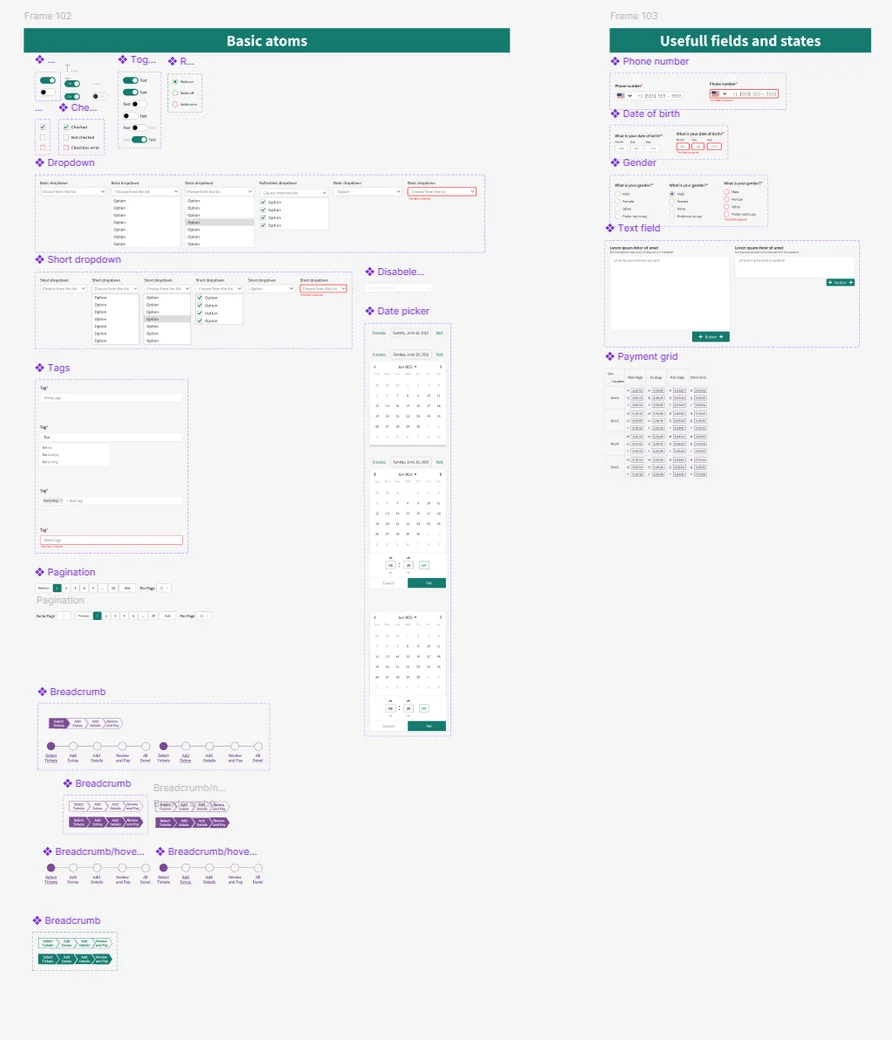
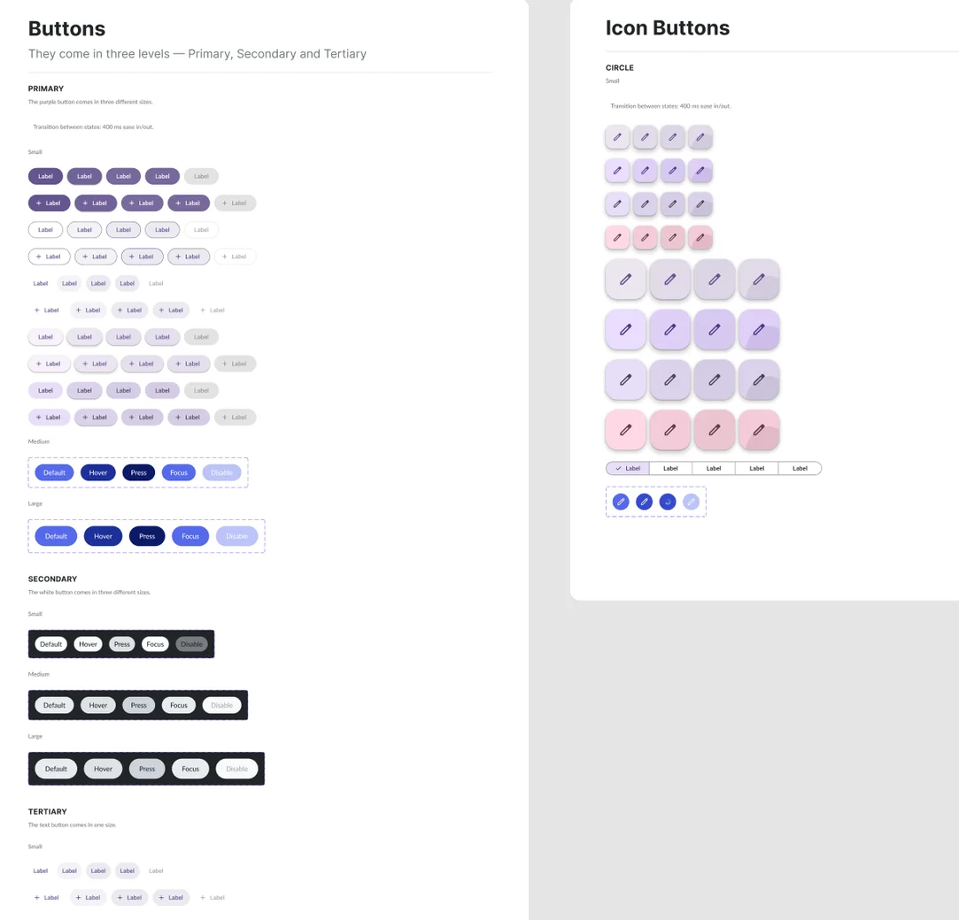
Upped Events. Components and variants. This was pre-Variables in Figma. Every reusable pattern was a component; variations were variants. The system covered buttons, cards, inputs, modals, navigation, and the core vocabulary of the admin panel. Tokens were applied at the style level (color styles, text styles). Semantic naming existed but the underlying layer was flat. The architectural thinking was already visible, but the tooling couldn't yet express a two-layer model cleanly.
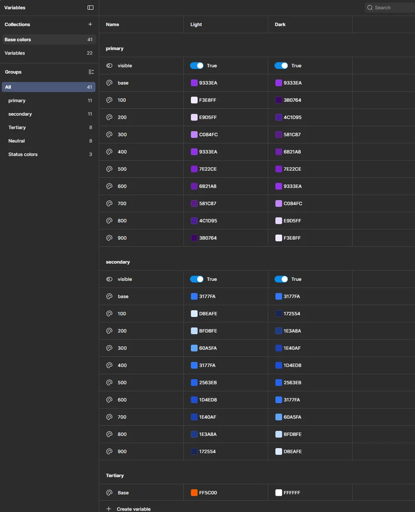
Events.com Admin Panel. Two-layer tokens. Once Figma Variables arrived, the token system could finally be expressed as two tiers: base tokens (26 raw primitives organized by color family and spacing) and semantic variables (19 tokens organized by function: Surface, Text, Border, Button, Spacing). Component state matrices covered default, hover, focused, pressed, and disabled states. Governance practice showed up too: alternative treatments pitched to the team for discussion, trade-offs documented, the system treated as a living negotiation rather than a frozen deliverable.
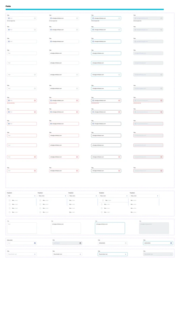
MakEntWin. Three systems, one architecture. Three independent design systems, all built solo, all sharing the same structural thinking. Two-collection token model (41 base colors + 22 semantic variables). Proper dark/light theme modeling with semantically inverted color ramps: primary/100 means "lightest contextual tint for this theme," regardless of which theme is active. 25+ components with 14+ code-connected via Figma Dev Mode. Domain-specific additions: localized fields for multi-jurisdiction deployment, tree views for hierarchical data, transfer lists for role and permission management. Each of the three systems adapts to its product. The Backoffice and Casino systems are dark-only; the Tumkasa wallet has full dark/light theme modeling because the consumer wallet context needs it. Scope-appropriate variation, not a rigid shared library.
Three decisions that carried forward
4.1. Semantic over literal, always
A token named Blue600 tells you its value. A token named Surface/Primary tells you its role. One of these survives a redesign; the other doesn't.
Read more
The naming decision looks trivial and is foundational. Literal tokens (Blue600, Red400, Gray100) describe what the color is. Semantic tokens (Surface/Primary, Text/OnBackground, Border/onPopup) describe what the color does.
Over time, values change. The brand updates, the palette refreshes, the dark mode gets added. If components reference literal tokens, a redesign means editing hundreds of components. Each one has a Blue600 fill that needs to become Blue700 or something else. If components reference semantic tokens, a redesign means changing the semantic-to-literal mapping in one place.
This is also what makes themes work. Light mode and dark mode don't have different components. They have different mappings from semantic tokens to literal values. Surface/Primary is Neutral/100 in light mode and a dark hex in dark mode, but the component that references Surface/Primary doesn't know or care.
I learned to default to semantic naming at Upped Events, where Figma didn't yet have proper variables, so semantic naming existed only in style names, with no enforcement. By Events.com and MakEntWin, Figma Variables let the architecture enforce itself. Same decision, different capability to express it. The tooling caught up to the thinking.
4.2. Domain-specific components belong in the system
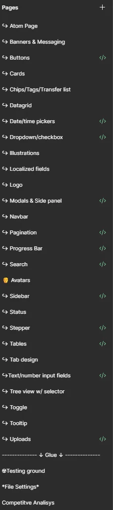
Design systems are often treated as generic: buttons, cards, inputs, done. The MakEntWin system has localized fields, tree views with selection, and transfer lists in its component library because those are the real primitives of the product's domain. The system doesn't stop at the generic.
Read more
The traditional scope of a design system is the generic UI layer: buttons, inputs, cards, the things every app has. Anything domain-specific gets treated as "not the system's job" and lives inside individual features.
That model breaks down at scale. A product that uses the same tree view in seven places ends up with seven slightly different tree views, each one a feature-owner's local implementation, and the inconsistency is exactly the problem the design system was supposed to prevent.
So the MakEntWin system includes domain-specific components. Localized fields, because multi-jurisdiction deployment is a first-class concern, not an edge case. Tree views with selection, because the bonus engine's rule builder and several other admin surfaces use them. Transfer lists, because role and permission management happens across multiple features. Datagrid, because the operator's data density demands a consistent table pattern.
These aren't custom components built for individual features and promoted later. They're designed at the system level, with the same state matrices and variant coverage as the generic components, because the product's actual primitives include this kind of complexity, not just buttons.
This is where the boundary between "design system" and "product design" stops being useful. A mature system is the architecture of the product's visual language, not just a styling layer.
4.3. Scope-appropriate variation, not rigid consistency
Three design systems at one employer don't need to be identical. The Backoffice system is dark-only because operators work in dark mode; the Tumkasa wallet has full dark/light because consumer wallets need both. Same architecture, different scope per product.
Read more
The instinct with multiple design systems under one employer is to force them into a shared library. One source of truth, no duplication, clean architecture diagram. It's the answer that looks correct in a design leadership interview.
In practice, it's the wrong answer when the products have different needs. The MakEntWin Backoffice is a dark-mode operator tool used during long work sessions. Forcing a light mode onto it because Tumkasa needs one would be adding architectural complexity with no user benefit. Tumkasa is a consumer-facing wallet with financial information that needs to be readable in bright light. Light mode isn't optional there.
So the three systems share one architecture and differ in scope. Same token-naming conventions. Same component state matrices. Same code-connection workflow. Different theme coverage, different component additions, different domain-specific extensions.
The consistency that matters is architectural, not literal. If the next product MakEntWin adds needs a fourth system, I already know how to build it. The decisions about how to structure tokens, how to name semantic variables, how to cover component states, are stable. What adapts is what the product actually needs.
This is the payoff of five years of iteration. The first system was a library. The most recent is an approach that instantiates into libraries. That shift, from artifact to practice, is what "senior design systems work" actually means.
What the three systems show, side by side
The three MakEntWin systems are the clearest evidence of where this practice has landed. Each covers its product's needs; each shares the architectural backbone with the others; each adapts where the product context calls for it.
Backoffice system. Dark-only. Component coverage focused on operator-tooling primitives: data tables, tree views, complex forms, bulk action patterns. The foundation of the 44-file Backoffice project. Every feature in the operator platform builds on this system.
Tumkasa wallet system. Full dark/light theme modeling, with semantically inverted ramps so primary/100 maps to the correct contextual tint in both modes. Component coverage emphasizes mobile-first consumer interactions: touch-target sizing, gesture-friendly patterns, transaction status affordances.
Casino system. Dark-only. Used across Tumslot and TumBet. Component coverage leans into consumer-casino aesthetics (high-contrast imagery, branded tile patterns, game-specific layout grammars) while still sharing the underlying token architecture with the other two.
The Upped and Events.com systems sit behind them in the timeline. They're not superseded (they served their products well and continue to), but they represent earlier iterations of the same thinking, built under earlier constraints. The practice visible in MakEntWin is what those earlier systems were growing toward.
Looking back
Design systems practice is the area of my work that's changed the most as I've worked. The thinking in the earliest system is already recognizable as mine: the instinct to separate structure from style, the preference for semantic naming, the bias toward flexibility at the foundation and specificity at the component level. What changed is the tooling's ability to express that thinking cleanly.
Read more
The Upped Events system would look primitive next to the MakEntWin systems. That's mostly because Figma's capabilities have grown enormously in the intervening years: Variables, modes, code connection, Dev Mode, all the infrastructure that makes modern design systems actually work.
But the underlying decisions are the same. Separate structure from style. Name by role, not by value. Design for flexibility at the foundation, specificity at the component level. Extend into the product's domain rather than stopping at generic UI. Build for scope-appropriate variation rather than rigid consistency.
If I were starting a new design system today, at a new product with its own constraints, I'd bring the same thinking and the newest tools. The system would look different from the three at MakEntWin (because the product would be different) but the architectural spine would be the same.
What I'd do differently: Nothing about the decisions. Quite a bit about how I've documented the practice. Each system lives in its own Figma file, with its own internal conventions, and the documentation of why things are the way they are is scattered across file pages, Slack threads, and my head. If I were starting over, I'd maintain a living practice document. Not system documentation (that's well-covered), but the reasoning behind the decisions that made the systems what they are. This case study is a retroactive attempt at that document. It should have existed all along.