What was going wrong
Running an event through Upped Events is a months-long process that touches most of the platform. In the weeks before the event, the organizer is configuring ticket types, onboarding staff, approving vendor applications, building the schedule, and setting up marketing. On the day of, they're tracking live revenue, checking in attendees, handling vendor issues in real time. In the week after, they're reconciling payments, reviewing attendance, reading feedback, and closing out the event's financials.
Each of those tasks lived in its own part of the admin panel. The organizer knew the features existed somewhere (they'd used them before) but remembering where meant either clicking through several navigation layers or learning the system's taxonomy by heart. A promotions manager preparing for Friday's festival would open the admin panel, spend 30 seconds locating staffing, finish the task, go back to the dashboard, search for the next thing. Repeat.
The existing dashboard wasn't solving this. It was a generic overview (a few key metrics, a task list, some shortcuts) and it was the same shape before, during, and after the event. Which meant it reflected the system's structure, not the event's timeline. Organizers weren't using it as a workspace; they were using it as a door to walk through on the way to something else.
Where I came in
I owned the admin panel's primary surfaces at Upped Events. The event dashboard was the most-visited page on the platform. Essentially every organizer session started and returned there throughout the event's lifecycle. Redesigning it was a solo project.
The brief was broad: the PM wanted "a better dashboard." My work was to figure out what "better" meant. Which, as I thought about it, pointed at a deeper question. The dashboard wasn't failing at being a dashboard. It was failing at being the right dashboard for the moment the organizer was in. Pre-event and post-event are not the same job. A single static layout can't serve both.
The shape of the solution
The design thesis: the dashboard should know what phase the event is in, and reshape itself around what that phase needs. Same underlying widget library, three different compositions.
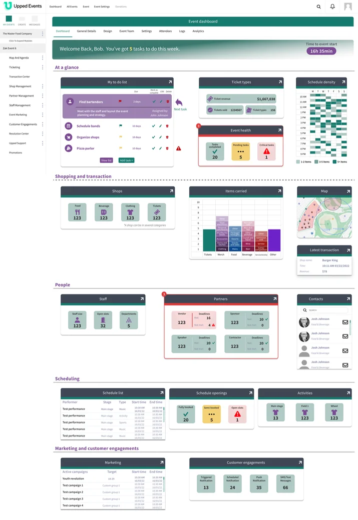
Pre-event. The dashboard emphasizes planning. Top-level widgets show ticket configuration status, scheduling density across days, a task list with approaching deadlines, an "event health" indicator flagging unresolved items. The shopping and transaction widgets are present but quieter. There's nothing to sell yet.
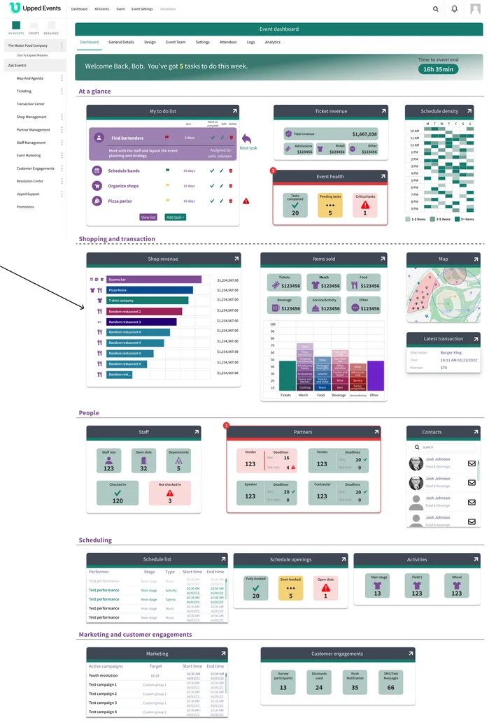
During event. The dashboard pivots to live operations. Ticket revenue replaces ticket configuration. Live shop revenue by vendor takes the main content area. Items sold updates in real time. Staff check-in status appears. Latest transaction feed surfaces. Everything that was about preparing recedes; everything that's about what's happening right now takes the center.
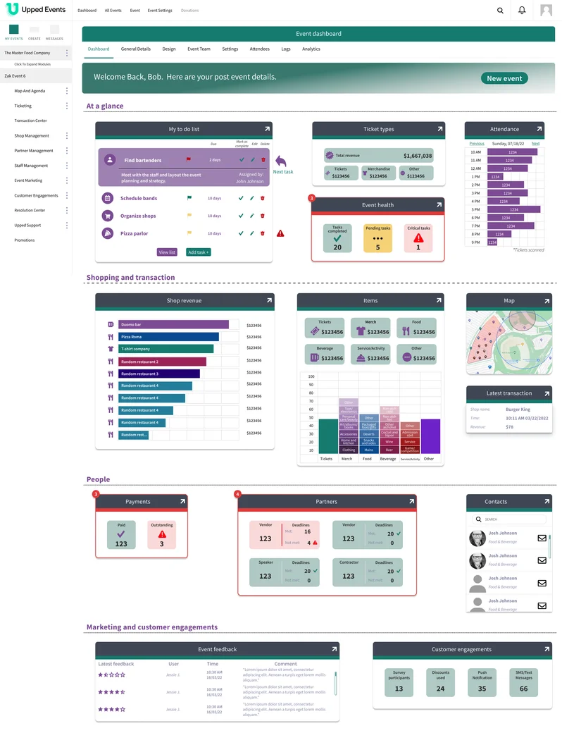
Post-event. The dashboard shifts again, now to retrospection. Attendance graphs, payment reconciliation (paid / outstanding), event feedback with ratings, engagement totals. A "New event" CTA appears. The main forward action for the organizer is now starting the next one.
The three layouts share the same widget vocabulary (the same chart components, the same card patterns, the same design system) but compose them differently based on what the organizer needs from the tool at that point in time. Phase detection happens automatically from the event's start and end dates. The organizer doesn't pick a mode; the dashboard knows.
Three decisions that mattered
4.1. Phase as a design variable, not a filter
The same widget shown at different phases isn't the same widget. "Ticket types (156 sold)" before the event and "Ticket revenue ($1.6M gross)" during the event are the same underlying data surfaced with completely different framings.
Read more
The easy version of a phase-aware dashboard is to show all the widgets all the time, then filter them by relevance. Hide what doesn't apply. It's technically simpler and it looks comprehensive.
But it's wrong. Filtering produces a dashboard that contains the right widgets. Reshaping produces a dashboard that leads with the right ones. The difference matters because the organizer's first glance decides what they do next. If the most important widget for this phase is fourth in the grid, the dashboard has already failed at its job.
So widgets don't get hidden by phase, they get recomposed. Ticket configuration and Ticket revenue share a slot: the first before the event starts, the second during. Schedule density and Attendance share a slot. Each slot surfaces the right question for the phase, rather than the same question with different answers.
This is also what makes the shared widget vocabulary work. The same card patterns, chart types, and grid system hold across all three phases, which means the dashboard feels continuous even as it changes. The organizer isn't learning three layouts. They're learning one workspace that evolves.
4.2. Designing for "the task I'm doing right now," not "the feature I'm in"
Organizers weren't thinking about "which part of the system does this live in." They were thinking about what needed to happen. The dashboard became the surface where intent-level tasks resolved directly, without navigation.
Read more
The existing navigation organized the admin panel by feature: Ticketing, Transaction Center, Shop Management, Partner Management, Staff Management, Event Marketing, Customer Engagements, Resolution Center. Every organizer task belongs to exactly one of those categories, and that's a clean system architecture.
It's also the wrong model for an organizer reaching for a quick action. "I need to check if staffing is covered" and "I need to approve the last three vendor applications" aren't feature names, they're tasks. Mapping each task back to its feature category is mental overhead the organizer shouldn't have to carry.
So the dashboard surfaces tasks directly: the To-do list shows approaching deadlines inline with check-off controls; the Staff widget shows total size, open slots, check-in status, with one click into whichever detail the organizer needs; the Partners widget shows vendor status by role with inline deadline warnings.
In testing, this showed up as a behavioral shift I hadn't expected: organizers stopped using the primary navigation. Once they learned what the dashboard surfaced, they completed tasks directly from widgets and went to the main features only when they needed something the dashboard didn't expose. The dashboard had become the primary workspace; the rest of the admin panel became the detail view for what the dashboard couldn't fit.
4.3. The same design system, three layouts, no mode-switching
Phase transitions happen automatically from the event's dates. The organizer doesn't pick a mode, doesn't configure a view, doesn't even think about phases. The dashboard knows what day it is.
Read more
An alternative design would have let the organizer pick the phase: a tab control, a segmented toggle at the top, a "view as" dropdown. That would have been more flexible and more explicit.
It also would have been wrong. The organizer has a job to do; thinking about which view to pick is cognitive overhead that doesn't contribute to that job. They already know what phase the event is in. They're living it. The dashboard's job is to match their state, not ask about it.
So phase transitions happen automatically. Before the event's start date, pre-event layout. Between start and end dates, during-event. After end date, post-event. The organizer's first visit after the event's start is a different dashboard than their last visit before, and they don't have to do anything to make that happen.
This also simplified the design. Because the phase is implicit, the widgets don't need meta-labels about which phase they belong to. A revenue widget during the event just shows revenue. A pre-event configuration widget just shows configuration. The dashboard's interface stays clean of mode indicators because the mode is already obvious from the content.
What shipped, what changed
The phase-aware dashboard was designed, prototyped, and validated through within-subject usability tests with real Upped Events customers, including organizers from the Alaska Beer Festival. Each tested user saw both the existing dashboard and the new one. Tasks that took them 2+ minutes to locate in the old system (finding staffing, checking vendor application status) took seconds on the new dashboard.
The strongest behavioral finding: users bypassed the primary navigation entirely once they'd used the dashboard. They stopped treating the admin panel's feature categories as the way to get things done and started treating the dashboard as the workspace. Every task went through the dashboard first; the feature pages became the place to go only when the dashboard couldn't resolve what they needed.
The dashboard was in the final stretches of implementation when Upped Events was acquired by Events.com. The implementation was deferred during the acquisition transition. The Figma file is complete, the validation is documented, and the design survived the acquisition as a reference artifact.
The same IA pattern, dashboard as intent-organized workspace, was later applied to a vendor-facing dashboard at Upped, where I led UX and research and partnered with another designer on visual execution. Same pattern, different user role, different mental model.
Looking back
The dashboard was validated qualitatively, through directed tasks and behavioral observation. Not quantitatively, through time-on-task metrics or instrumented analytics. That's a real limit. The "users bypassed navigation" finding is strong because it's behavioral, but without production instrumentation, I can't say how durable it was across months of use.
Read more
Good usability research on a prototype is cheap. Good usability research on a shipped product is expensive, and requires tooling most small design teams don't have at hand.
The dashboard's validation came from moderated remote sessions: me watching a user work through tasks on both layouts, noting friction, asking follow-up questions. It's the right kind of research for the kind of questions I was asking ("does this reshape the organizer's mental model?"), and the findings were strong. But I was one designer running sessions with a handful of customers, and the sample was small.
Without production instrumentation, I didn't get to see whether the behavior held over weeks. Did organizers keep bypassing the navigation after the novelty wore off? Did new organizers learn the dashboard faster than they learned the old admin panel? Did the three-phase transitions feel natural, or did they feel jarring when they first happened? I have hypotheses on all of these. I don't have data.
What I'd do differently: If I were designing this again, I'd build in measurable moments: instrumentation hooks for specific widget interactions, optional lightweight feedback prompts at phase transitions ("Is this helpful right now?"). Not as dashboards for the team; as the smallest possible instruments that would tell me whether the design thesis held in production. The goal isn't full analytics. It's the minimum evidence the next iteration of the design needs.