What was going wrong
Comping tickets was a known pain point at Events.com, and it took two forms depending on event size.
At smaller events, the organizer handled it themselves. They'd create a $0-priced ticket type, email it to individuals, and hope nothing fell through the cracks. No items could be attached. No t-shirts, no parking passes, just a bare ticket.
At larger events, a Customer Success agent did the same work at higher volume, sometimes comping hundreds of tickets in a single batch, one recipient at a time. No batching, no CSV upload, no way to track which comps had actually landed.
Both paths produced support tickets: recipients who never got their comp, items that were promised but couldn't be issued through the system, organizers asking whether a specific comp had gone out. The Customer Success team eventually flagged it as a product gap. The CSM met with the PM, wrote a two-page requirements document, and that's where I came in.
Where I came in
The 2-page requirements document gave me the what: a feature for comping tickets to individuals and batches, with item support, built into the existing event admin panel. It didn't give me the how. No flows, no IA, no interaction decisions. That was my work.
I was the sole designer on the feature from requirements through final Figma handoff. The PM owned scope and prioritization, the CSM represented customer success and organizer needs in review, and engineering implemented against my designs. Collaboration where it helped; solo ownership on design decisions.
The shape of the solution
My first pitch was a side-modal: a single dense surface where you'd select recipients, pick ticket types, and assign items all in one place. It looked clean in Figma. It failed in review.
The feedback from CS agents was clear: "This is too much at once. We context-switch constantly during support calls. Give us one thing to focus on at a time." The self-serve organizers in the review echoed it. They weren't power users; they wanted to be walked through the flow, not dropped into a cockpit.
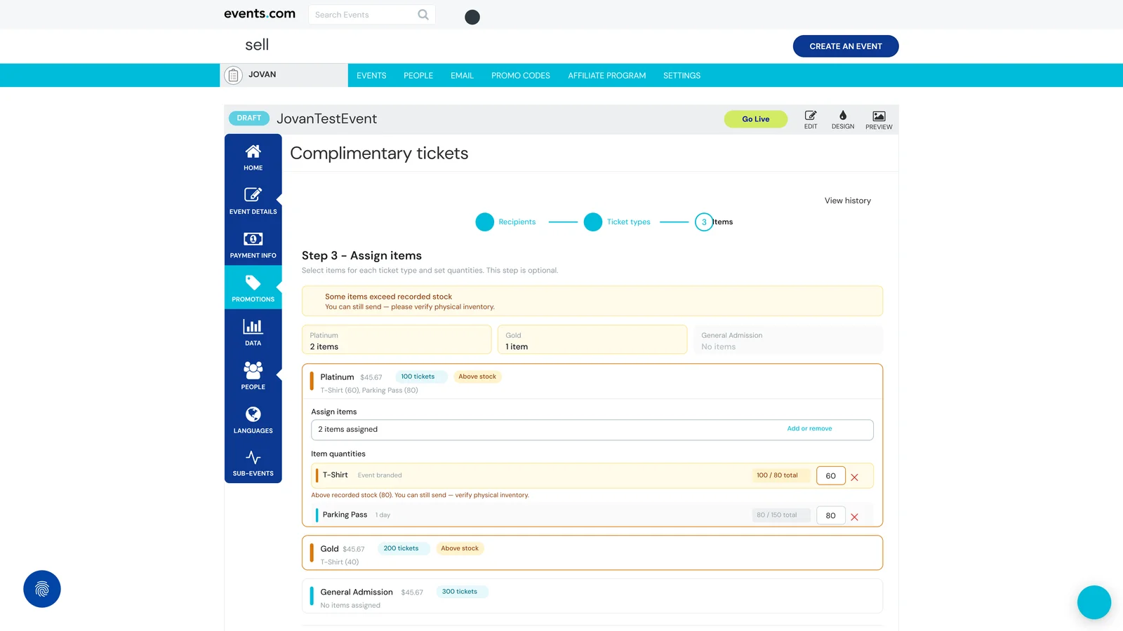
So v2 broke the flow into three steps, each on its own page:
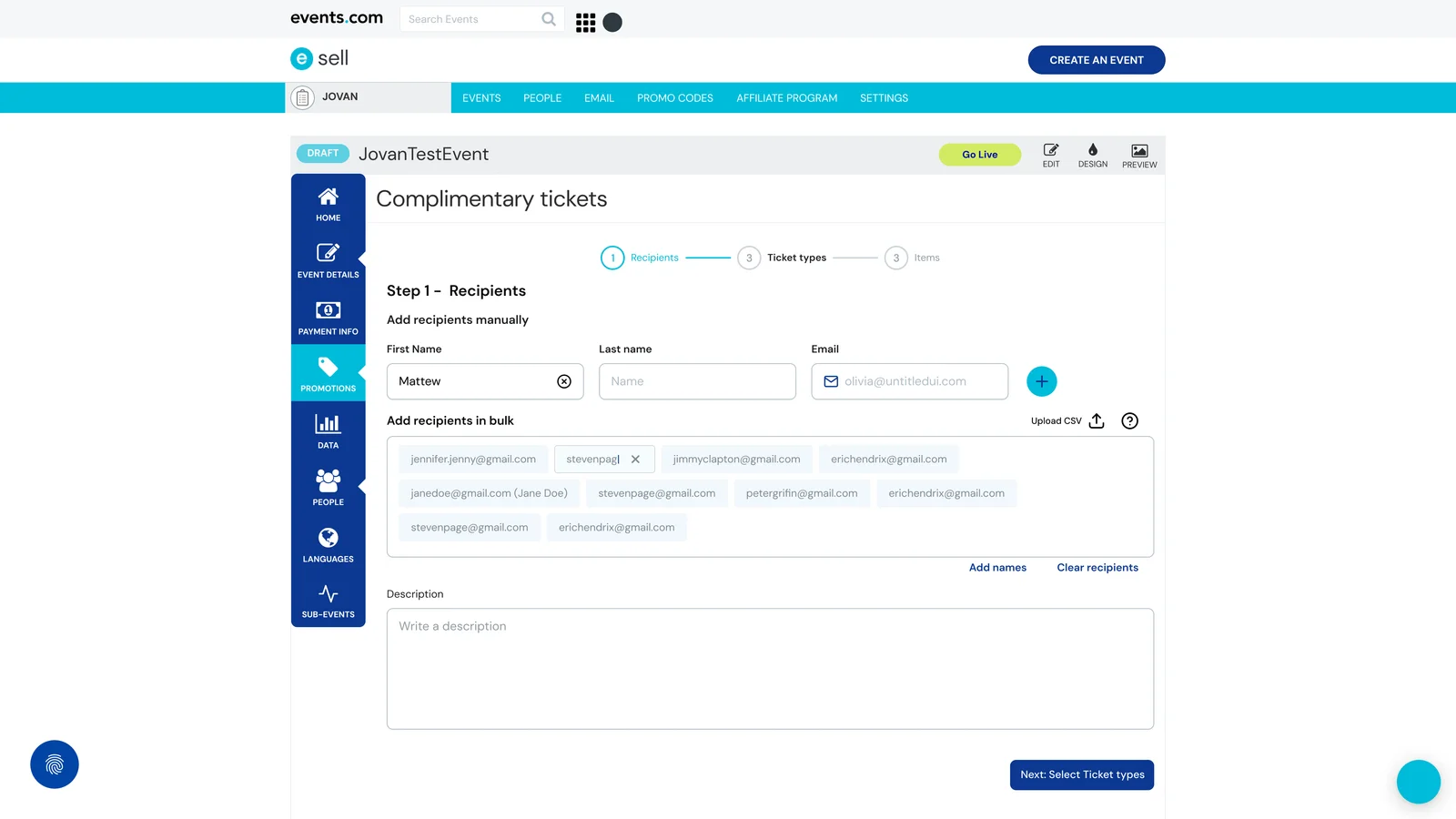
Step 1. Recipients. Who's getting the comps. Dual-input: manual entry (First name, Last name, Email) for small-batch work, plus a bulk paste/chip entry and CSV upload for CS agents working at scale.
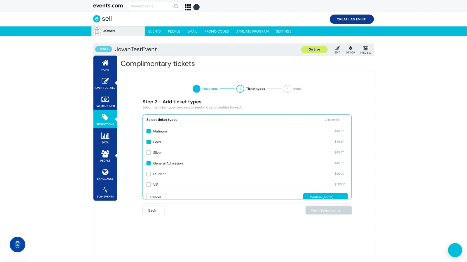
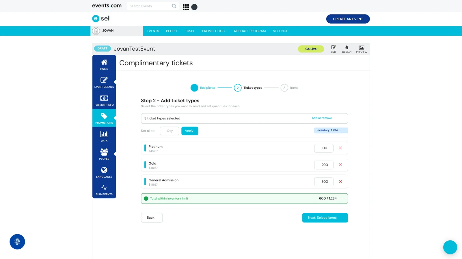
Step 2. Ticket types. Which ticket tiers to send, with per-recipient quantities. Ticket types shown with prices so the user sees the implicit value of what they're comping.
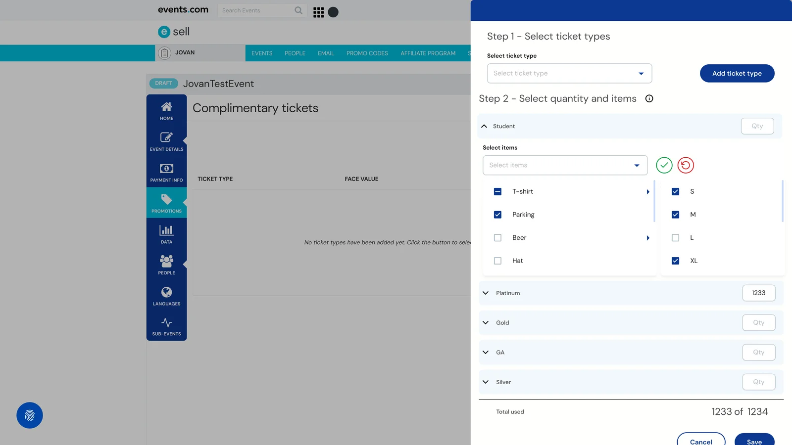
Step 3. Items. Optional. Assign items (t-shirts, parking passes, merch) to each ticket type, with stock indicators and soft validation when requests exceed recorded inventory.
There was also a companion feature I designed, a Comp Batch History with delivery status and resend, which would have given CS a way to track and recover failed comps. It got deprioritized for engineering resources and hasn't shipped. I'll show it at the end.
Three decisions that mattered
4.1. Dual-input for recipients
The feature had to serve CS agents comping hundreds of tickets and organizers comping five. So Recipients had two input paths on the same screen: not two flows, one flow with two affordances.
Read more
Most wizard-style pickers pick one input style and commit. Either everything is a manual form (fine for small batches, punishing at scale) or everything is CSV upload (fast at scale, overkill for five recipients). Splitting it into two separate flows ("are you comping few or many?") would have worked, but it would have forced a decision upfront that the user doesn't want to think about.
So I put both on the same screen. Manual entry at the top: First name, Last name, Email, with a plus button to add each recipient as a chip. Below it: a paste-or-upload area that accepts chips or CSV and parses both "Name <email>" format and plain emails.
Organizers comping five type them in. CS agents paste the list and move on. Same screen, same step, no forced-choice at the door. The dual-input is itself the two-user design thesis, made concrete in one interaction.
4.2. Hard gates on structure, soft validation on stock
You can't proceed without ticket types selected. That's structural, the feature breaks without them. But you can proceed when item quantities exceed recorded stock, because physical inventory is the real ground truth, not the system record.
Read more
The default move on "over-stock" warnings is to block the user. It feels safer. It isn't.
CS agents at Events.com often know the physical situation better than the database does. Extra t-shirts arrived that morning, parking passes were printed in bulk, the warehouse manager confirmed the overage in person. If the system blocks on stock, the user either has to find a workaround (bypassing the feature entirely) or call engineering (defeating the whole point of the feature).
So stock is a three-level warning, not a gate. Banner at the top of Step 3: "Some items exceed recorded stock, you can still send, please verify physical inventory." Per-card warning. Per-line warning with a direct link to verify. The user is informed three times; they're never stopped.
Structural gaps, on the other hand, do block. You can't go to Step 3 without ticket types selected in Step 2. The assignment screen doesn't have anything to assign to. That gate is non-negotiable because the feature doesn't function without it.
The split is the point: hard gates on structure, soft validation on business judgment. The tool respects the human where the human knows more than the system does.
4.3. Progressive disclosure on the assignment step
Step 3 shows the cards that need attention expanded, the clean ones collapsed. The UI does the triage work the user would otherwise have to do themselves.
Read more
By the time you're on Step 3, you might be assigning items to six different ticket types. Showing all six expanded at full detail turns the screen into a scroll-fest, which is exactly what sent me back to the drawing board after v1.
So Step 3 knows which cards matter. Cards with stock warnings expand by default, that's where the user needs to look. Cards that are clean collapse to a one-line summary with a "200 tickets · T-Shirt (40)" style header. The user can expand any collapsed card if they want to, but they don't need to.
This is the same principle v1 got wrong at the whole-screen level. A wizard's job is to focus attention. If every step is dense, the wizard isn't doing its job. It's just a multi-page form.
What shipped, what changed
The three-step wizard shipped at Events.com. A quarter after launch, the CSM reported back: support tickets related to comping tickets dropped by roughly 40%.
That number came from their side of the business, not mine. I didn't instrument the feature for it. What the feature solved was the specific set of problems named above: recipients not getting comps, items not making it through, organizers asking whether a specific comp had gone out. The reduction is most directly attributable to eliminating manual one-off ticket creation, the workflow that had been producing most of the support load in the first place.
The feature now serves both user types on the same flow. CS agents comp in bulk. Organizers comp in small batches. Neither group has to think about which mode they're in.
Looking back
The wizard ends at "Send." The tracking and retry layer lives in a separate surface I designed alongside it, a Comp Batch History with delivery status and resend, which was deprioritized for engineering resources and hasn't shipped. Not a fix for the wizard; an audit piece on top of it.
Read more
The wizard does its job. Comps go out, items get assigned, the support queue gets quieter. But the feature's natural edge is the moment after "Send," the point at which control passes from the system to the email pipeline, the recipient's inbox, and the world.
The Comp Batch History is the surface that would have given CS visibility across that edge: every batch sent, recipients with Success or Failed delivery status, resend action on the failures. Nothing about it was novel. Batch listings with retry are standard infrastructure in most mature SaaS platforms. It just hadn't been built yet at Events.com, and the wizard was the right place to finally build it.
The Figma file is approved. Engineering resources weren't available in the quarter the wizard shipped, and it hasn't come back up since.
What I'd do differently: Less "push harder for History" and more "be clearer upfront that the wizard has a natural edge where tracking begins." The feature can be honestly described without History, but if I were selling a v2 to stakeholders today, I'd start by naming the boundary and the audit piece in the same sentence.